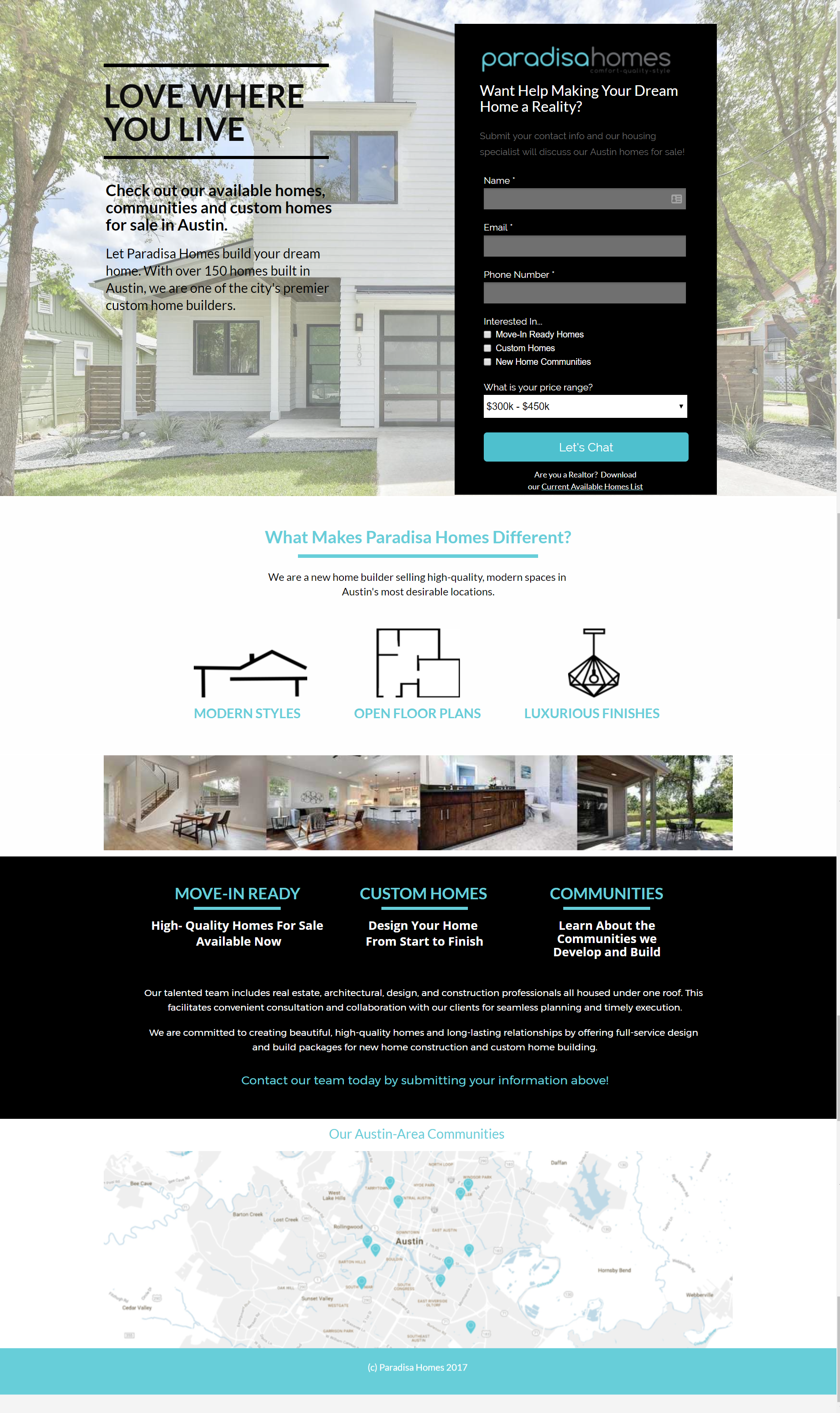
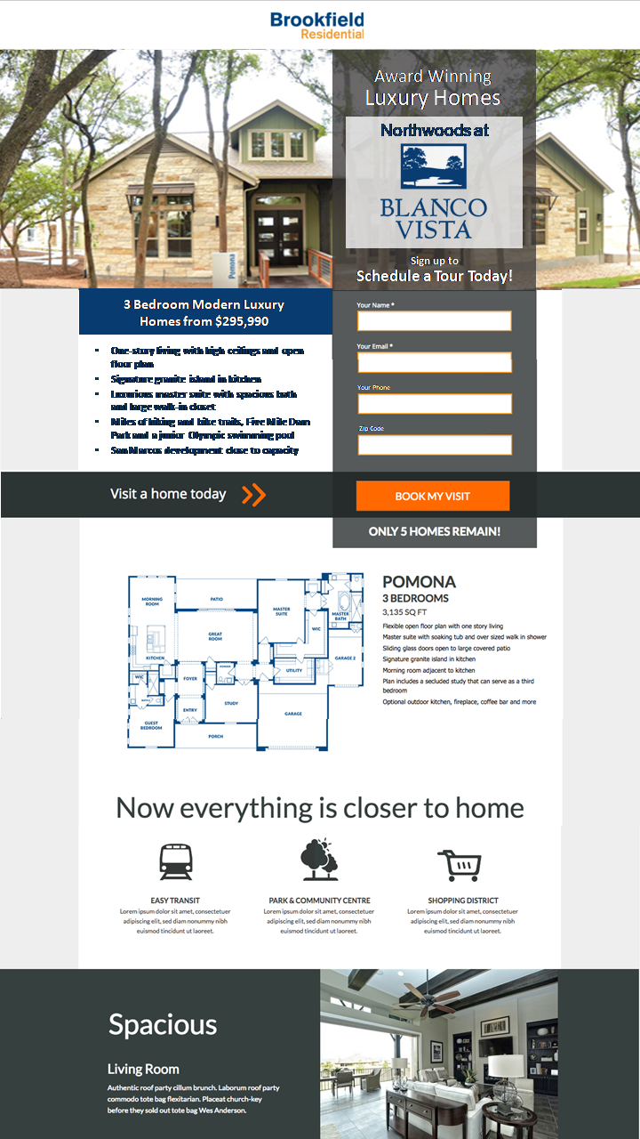
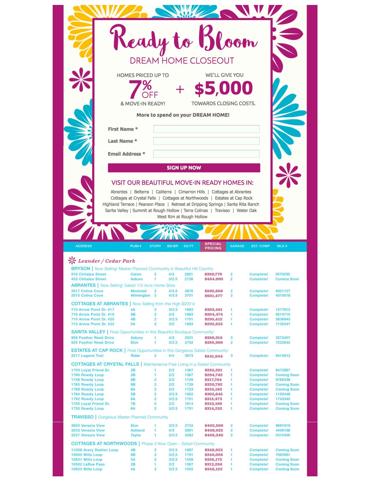
If a sold home is the ultimate destination in the long buyer journey people take when buying a home, landing pages are often the vehicle that starts the journey. A landing page is an independent page on your website, void of any navigation or links to social media, that is devoted solely to capturing leads. It should quickly and clearly get across who you are and what you have to offer.
Keep in mind that visitors coming to you from Google Adwords or any other media might be learning about your brand for the very first time. The copy, imagery, CTAs, and forms on these pages should be chosen to provide enough information about your homes to make the visitor want to know more.
Table of Contents
ToggleSix Ways Landing Pages Work for Home Builders
Generating traffic to your website is great, but often full websites provide information overload and do a poor job of presenting the visitor with a clear next step to take. That’s where landing pages come in. These pages are specific and customized around a particular offering, with persuasive copy to convince visitors to take action. They also help users understand the next step in the home buying process, giving them a clear idea of how they can move forward if they are interested. More specifically, here’s how landing pages drive more leads for home builders and developers.
-
Landing Pages Get Your New Community Online Faster
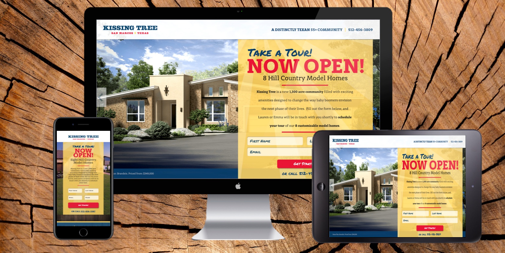
Websites take time to develop, time that a brand-new community could be gathering pre-sell interest. No need to wait for your entire website to get designed, developed, tested and launched: a landing page will get you online and gathering leads in a fraction of the time.
-
Landing Pages Drive Specific Action(s)
“Contact us” is a common call to action on landing pages, but it’s certainly not the most clear directive. And let’s face it, not everyone is ready to be contacted by a sales rep. By providing several different calls to action on a landing page, you can make sure you have an option for everyone, no matter what stage of the buying cycle they are at.
Potential customers could be given several different options as a next step, such as signing up for a promotional event, scheduling a tour, receiving a more detailed community brochure or floor plan, adding their names to your email list to receive updates, or requesting a call from a representative. When done properly, this gives users a variety of distinct and actionable next steps to take and increases the likelihood the visitor takes action.
-
Landing Pages Make You Memorable
A home buyer browsing online has probably already seen dozens or even hundreds of homes and communities. According to the National Association of Realtors, Google searches for real estate have grown 253% in the last four years. The sheer volume of listings one can look through on Zillow or Trulia is dizzying.
By utilizing a landing page for your marketing campaigns, you allow the user to concentrate on the most important information about your community. And by eliminating a top-level navigation, you narrow down users’ choices: either read the info, like it and then contact us, or leave. It simplifies the process and in most cases leads to higher conversion rates than simply sending prospects to your full website.
-
The Home Buying Decision Is a Process
Getting an interested home buyer to your site is a step in the right direction, but all the traffic in the world means nothing if it doesn’t translate into a lead for your sales team. Landing pages allow you to cater to customers in different stages of the home buying process, creating distinct sales pitches and calls to action for various groups.
-
A landing page created for a specific ad group or campaign can help you achieve a higher quality score by having content specific to the keywords people are searching for. Google factors in the relevancy of your landing page content to the keywords searched. If you have copy that aligns with what the user was searching for, Google rewards you with a higher quality score. This means you pay less per click.
-
Landing Pages Can Be Combined with Other Campaigns
A drip email campaign, promotional event and/or remarketing ads all work in harmony with landing pages. While Google Adwords or social media ads can attract audiences to landing pages, getting the visitor to take action allows us to nurture that lead via drip email campaigns. Remarketing makes it possible to follow them around the internet during the long sales cycle, reinforcing your branding and ultimately keeping you in front of potential buyers.
Five Ways Landing Pages Work for Builders
Landing pages work best when you use them selectively to promote new developments, promotions, and events; otherwise, they lose their effectiveness. Here are a few situations where a home builder landing page is appropriate.
- New Developments/Presales. When you have many units to fill, a landing page simply makes sense. Landing pages typically outperform general community pages, and they actually create leads.
- Slow-Selling Developments/Homes. Selling out a development can take time. Sometimes even the best condo developments have one or two problem units that are hard to move. A landing page can draw specific attention to homes or units that need to move now. An entire page dedicated to one home and all its positive selling points can help renew interest in an otherwise overlooked option.
- Allowances such as floorplan options or design center upgrades
- Goods such as flat screen TVs, furniture, cruises, scooters or even free gas cards just for touring the models.
- Opportunities to “spend the night” in a fully furnished home for serious prospects
- Financial perks such as lowered prices, pricing guarantees or paid closing costs
By sending search or social traffic directly to a page with all the details of the promotion, you can encourage them to fill out a form in order to be eligible for the promotion.
- Grand Openings, Home Tours and Special Events. Event registration landing pages can promote home tours, open houses, special events and more — and capture quality leads in the process.
- Targeting Specific Audiences. Your community could likely appeal to more than one type of buyer. Using landing pages, you can harness the power of your targeted media campaigns, creating distinct pages with unique language, imagery and design elements to appeal to each group.
Four Quick Tips for Driving Landing Page Success
Naturally, if you want a landing page to create leads, you need to design it with your audience in mind. With home buyers increasingly spending more of their search online, the landing pages you create need to be competitive and memorable. Here are a few tips for doing it right.
- Make It Mobile-Friendly. Some 89 percent of new home buyers use a mobile search engine throughout their home search. So, if you’re not designing your landing page to load quickly for mobile users, you’re going to negatively impact your page’s performance.
- Consider What Goes Above the Fold. If visitors have to scroll to find important information, you’ll have to hold their interest that much longer. Don’t take the chance. Instead, place the most important and enticing information above the fold (that is, in the first few paragraphs of copy, which they can see before they have to scroll down). Include a call to action or a form that at least peeks above the fold so the next logical step is immediately obvious.
- Include Clear Language About What Happens Next. Too often we see forms in which it is simply unclear what the business is going to give the user once they sign up. Set clear expectations about what happens next. If your sales team is going to call them, tell them when they can expect a callback. If you are providing an instant download of a floorplan or brochure, let them know it will be instantaneous. If you’re going to email them more info, say this. Use clear language around the call to action so customers will know exactly what they’re signing up for. CTAs should also stand out, with colors that contrast with the rest of the page as well as action-oriented words and phrases.
- Automate Your Lead Nurturing. We will devote another article to the subject of automation. But for now, we’ll just leave it at this: using a marketing automation system allows form-fills on your landing page to automatically trigger email marketing nurture campaign communication to be sent out at predetermined intervals. It can also automatically create follow-up tasks in your CRM for your sales team.
Of course, you could say a lot more on the topic of landing pages — and actually, we have. For a start-to-finish guide to landing page creation, check out our ebook You Are Clear for Landing. Or if you’d rather have your landing page created by experts, contact us now to call in the pros. With our help, the leads will land right in your lap!


